Product Management × Product Design · Sync
TV Navigation
Where we are & what's left to decide
A look at the journey, the prototype, the open decisions — and where we want your input. Conversational by design; please jump in.
The journey
How we got here (≈3 weeks)
Weekly syncs + a lot of async (Slack, recorded crits) across timezones.
What we explored
Wide first, then narrowed
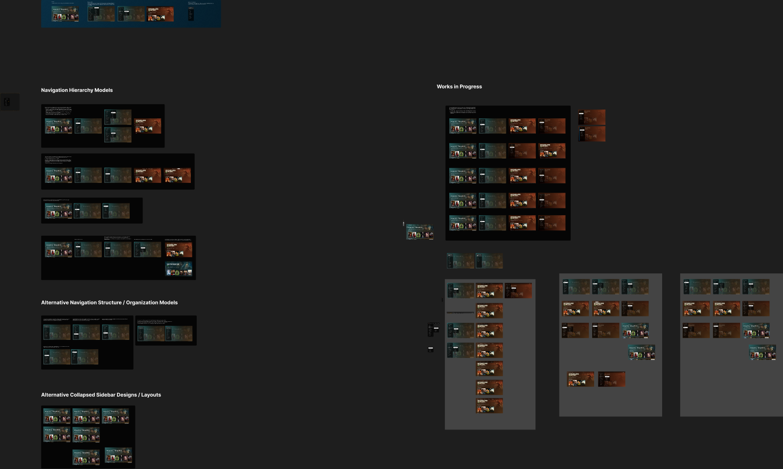
- Nav hierarchy models — Flyout · Drill-In · No-Subnav
- Menu organization / IA — what lives in the side-nav & order
- Collapsed sidebar styles — how the menu rests on content
Round‑2 then filtered these down to the strongest few.
Where we've landed
Aligned AGREED Shelved DROPPED
- Side-nav is an overlay, not content-push
- Left main panel + flyouts for section pivots
- Apple-style top pills + sliding panel
- Minimized icons use backgrounds
- Live TV / OTA fold into the personal library
- Flyouts behind a dev toggle → dogfood & user-test
- Drill-down navigation — shelved (no consensus)
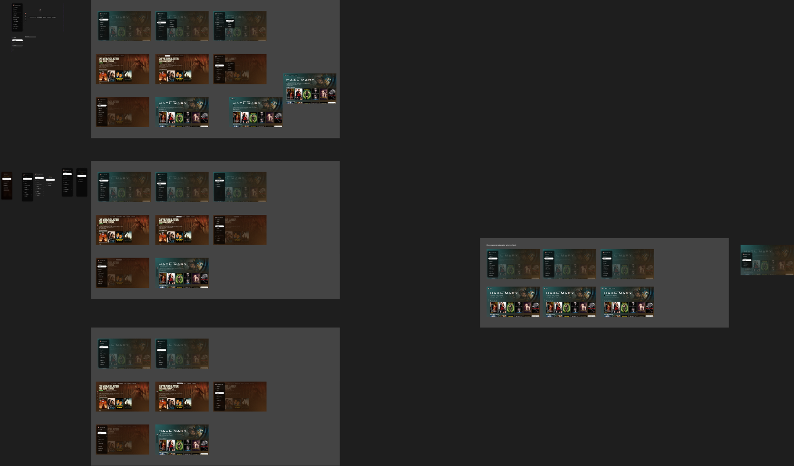
The prototype · live
A real, drivable model jason-tv-navigation.pages.dev
Dev toggles (press `):
- Nav mode: Flyout / Drill-In / No-Subnav
- Show vertical rail · Home pivots
- Tab position · submenus-on-focus
Keyboard arrows or a gamepad. Lets us A/B behaviors live in dogfooding.
The open crux
Discoverability on Home OPEN
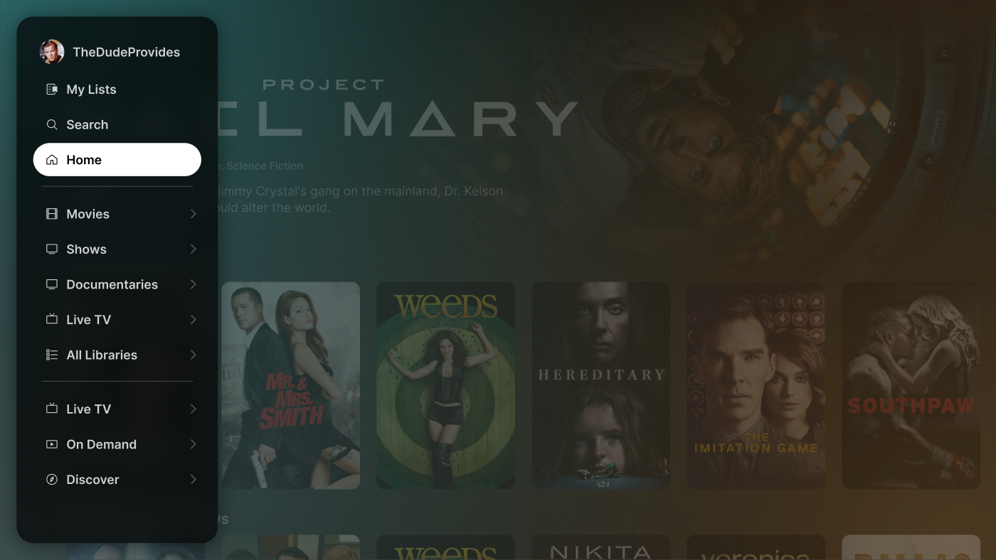
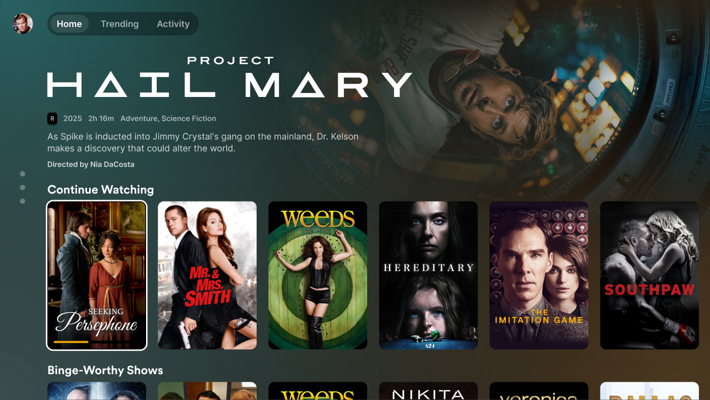
Hiding the side-nav on Home keeps it clean — but is a <, an avatar, or a few dots enough for users to find primary nav? Clean 10‑foot UI ⟷ discoverability.
Key decision areas
What we still need to choose
Why it's been hard
The decision-making challenges
- Async + timezones — people miss meetings, return out of sync
- Summaries overstate consensus — "decided" in notes ≠ settled in the room
- Proto drift — the Figma proto (loved) and the full prototype differ in small but felt ways (tab alignment, sidebar-in-library, the transition)
- Imperfect analogy — Apple TV inspires us, but Plex has secondary nav Apple doesn't
- Taste tension — clean/minimal vs discoverable
- Tech lift — always-on-top vs scroll-away top nav; flyout complexity
Organized feedback
What the team is saying
What's left to decide
Next steps
- Align on the Home indicator — review the original proposal + indicator variants; everyone gives (A) concerns with the original, (B) feedback on the indicators
- User-test the flyouts — do people intuitively find & use the menu? (Jason + Amanda)
- Feature-flag + dogfood build — toggle in real usage (Douwe)
- Defer (intentionally) — sidebar ordering & Live TV/OTA labeling
Where we want PM input
Let's talk
- How much discoverability risk are we willing to take for a cleaner UI?
- Appetite & timeline for user testing before we commit?
- Prioritization vs the Apple TV / Android TV release windows?
- Any constraints we should design to that we're missing?
Live prototype → jason-tv-navigation.pages.dev · Figma → Sidenav-Explorations